Please enjoy each fact equally
- Judit Bekker

- Jun 18, 2022
- 4 min read
Updated: May 1, 2024
The last time I created a new viz was nine long months ago. I got sucked into work and had no motivation to look at any data after 5. When I started watching Severance, I suddenly felt a twinge of excitement again. The data collection was fully manual (nothing new – I already did this a couple of times), but this is the most detailed dataset I gathered. Here’s everything I tracked:
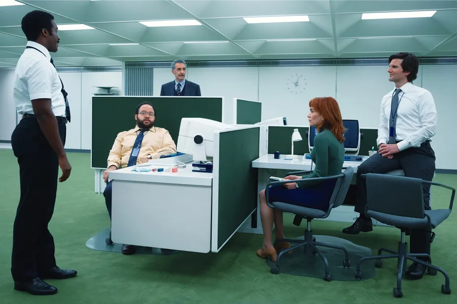
All scenes where the main characters are present (Mark S., Helly R., Irving B., Dylan G.) and whether they appear as their Innie or Outie (among a dozen of other things)
Complete location tracking from the first scene to the last
Tracking Severance was not an easy subject. I tried not to overcomplicate it, but it’s crucial to mention the methodology I followed during the collection process.
How did I track scenes?
When someone is alone in a scene, the start timestamp is when they first appear, and the last is when we no longer see them. When the scene itself continues, but there’s a cut in-between – for example, we’re at Lumon watching Mark, but suddenly there’s a cut showing Ms. Selvig’s house, then we go back to seeing Mark) – those are counted as separate scenes.
When there are at least two people in the scene, the same applies to the first and last timestamp with one big difference. If there’s a scene where all MDR is present that lasts 60 sec, and Irving appears first at 10 sec, we don’t see him until 48 sec, and he disappears at 50 sec, this is how the log looks for him: start timestamp – 10 sec, end timestamp – 50 sec.
Take a look at the interactive version of the viz on Tableau Public.

Inspiration & wireframe:


Color choice
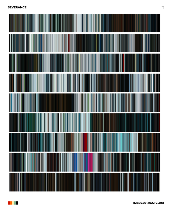
I wouldn’t say that I’m madly in love with the chosen colors, but these are so significant in the show I couldn’t do otherwise. I tried not to oversaturate but at the same time give that Severance feeling back. I selected a couple of screenshots (Severance color palette on Reddit) to source the colors from:
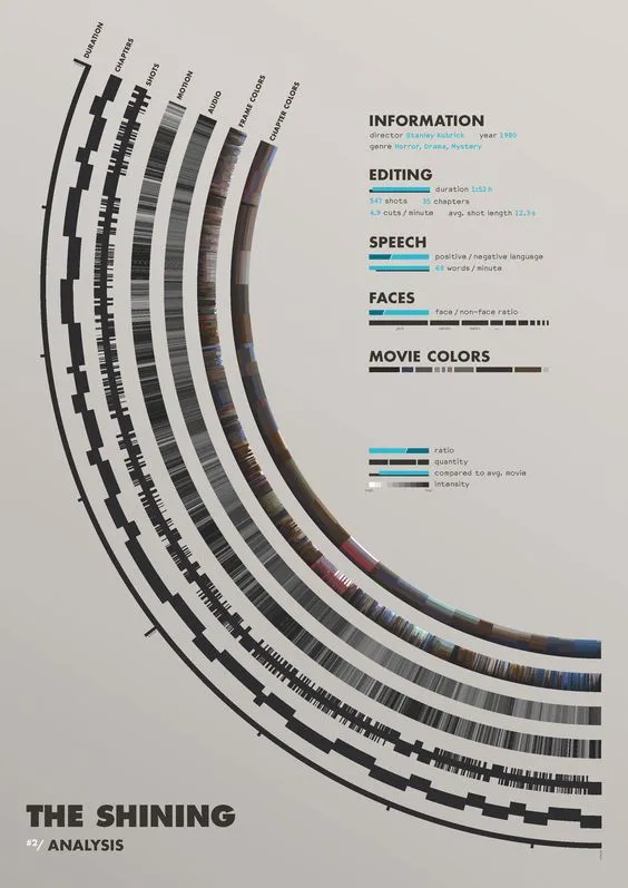
The challenge
Long gone the times, I enjoyed doing something I already did, but it’s hard to come up with new styles/chart types at a regular cadence. I finished the data collection a few days ago and had no idea what to do with it. Then I decided it was time to dust off that circular gantt chart idea and spice it up by just showing one quarter. To me, it looks like a clock that shows the time from 3 to 6, where the main characters are both present as Innies and Outies.
The no.1 problem was that this idea needed dusting because I’ve tried already and couldn’t do it. I had to understand the logic, what I wanted to achieve, and some theories I’d like to test before seeking help. In Step 2, I reached out to my forever go-to person, István Korompai, who always pushes me in the right direction and writes the last piece of the puzzle as a finger-work. I sent him my idea and exchanged some back-and-forth drawings.
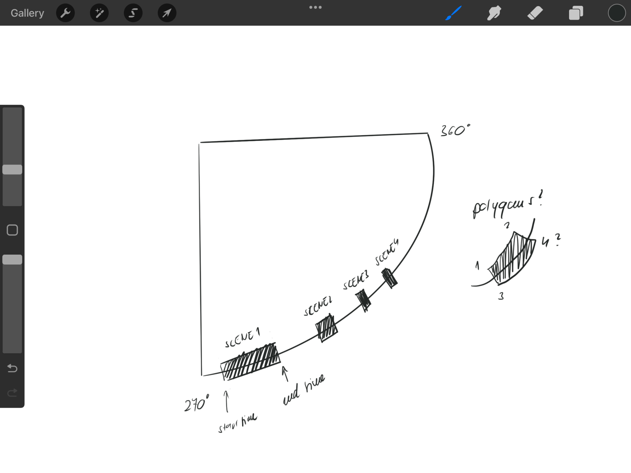
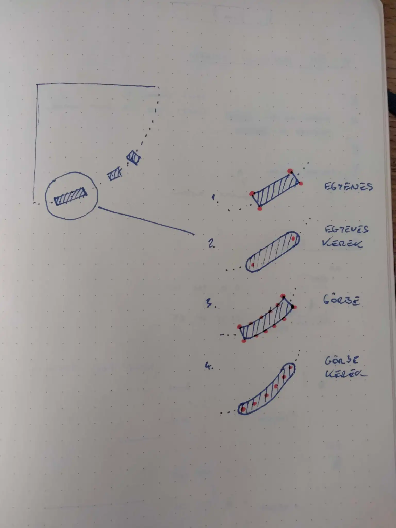
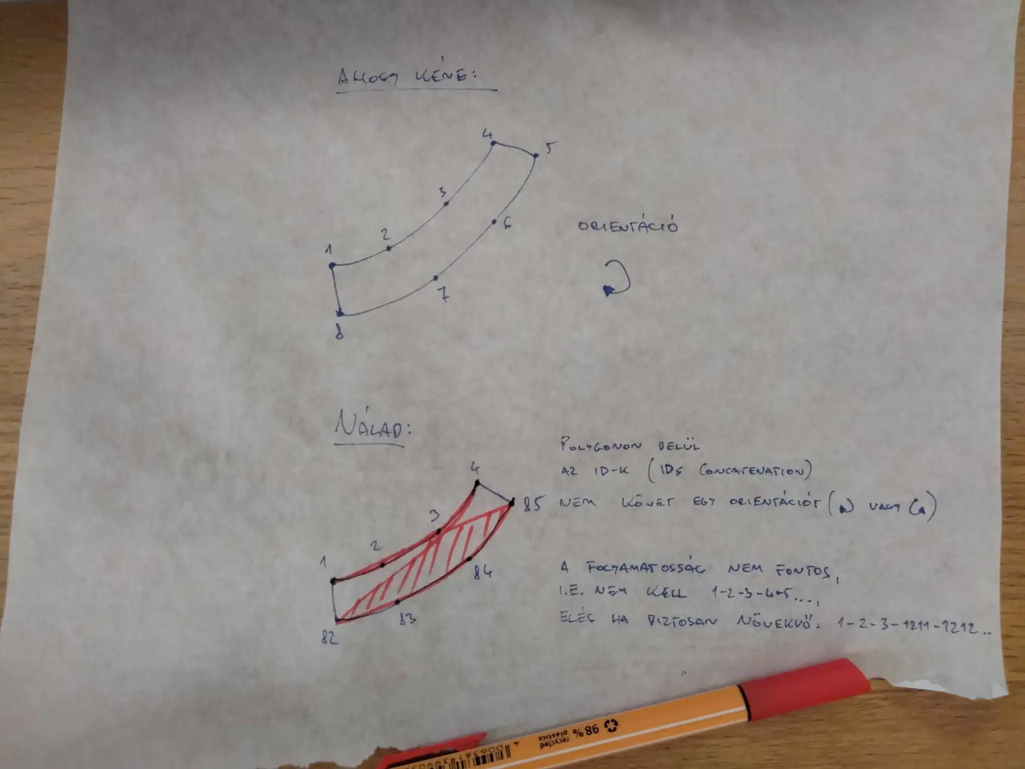
It quickly turned out that it’s not enough to know the start and end point of scenes, but we’d need intermediary points and two set of lines to make the polygons. So I had to duplicate the data to have the two lines, then do a cross join on a date table for the in-between points. Even though it looked all right, the blocks still consisted of individual points instead of forming a curved bar chart.
The reason for that, was the wrong order of points, but there came Pisti to save this chart. He changed my table calculations to LoDs and wrote a monster calculation for the point order. The workbook is downloadable to see for yourself how we built the calcs. Let’s hope one day he will write a tutorial on the topic. But the curved gantt chart did happen after all!
Receiving feedback
I don’t usually ask for feedback because by the time I finish a visualization, I already settle on a design. But in this case, I did seek advice, and even if I had to implement some changes to make it more logical and readable, it totally worth it. I first talked to a fellow Severance fan, Anne-Sophie Pereira De Sá, who pointed out my inconsistent color usage. She was 100% right – following our discussion, I changed the Lumon color coding to green instead of the blue on the location tracker chart, and Helly’s escape attempts orange on the curved bar.
And then I posted it on the Severance subreddit, where the lawful reddit police called out that Dylan did wake up as an Outie during the Overtime Contingency protocol. I checked the data, and again, they were right. I fell into the trap of rounding, but that 14 sec had to get justice. They also pointed out that my Futura font does not match the style of the show, so I changed it to SF Pro, which I believe is closer to the original Severance typeface.

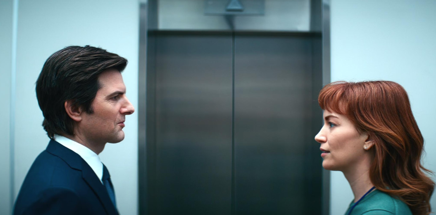
If you still don’t feel convinced to watch the show, here’s the single best moment of recent television history:


I used to think that needing help meant I was failing, but hiring someone to help with my online class taught me otherwise. When I decided to hire someone to take my online class, it was out of necessity, not laziness. I had multiple responsibilities that couldn’t be ignored. The help I got was reliable and confidential, and the performance exceeded my expectations. Sometimes getting help is just being smart about your time and priorities.